tin y e NORM o us.jpg

Some artists want to have their fun and eat it too. They want to be taken seriously and they want to maximally enjoy what they’re doing. They want their stuff to look great but they don’t want to spend the extra money to upgrade their materials from “student grade” to “professional grade.”

I confess: I am a big slob. My materials are below “student grade” when I can find them in the Clearance bin, or, better yet, on the street. Even so, making images is one of the most important things I can do, taking a back seat only to building relationships.

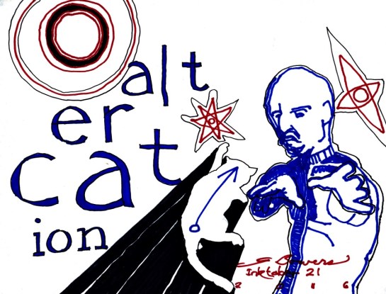
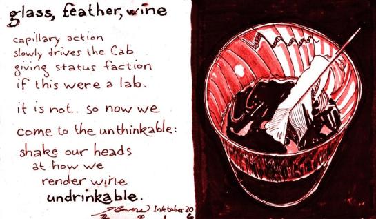
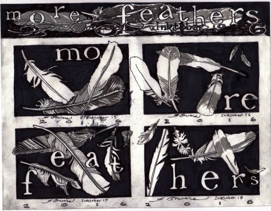
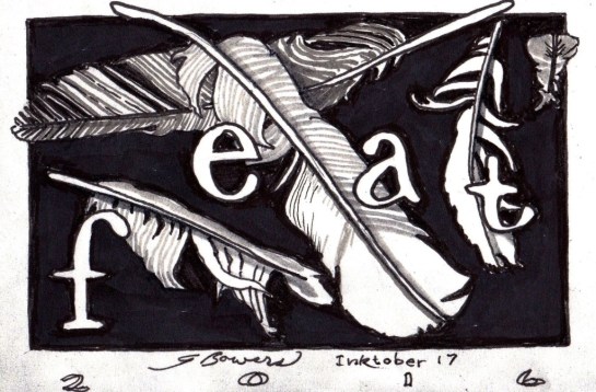
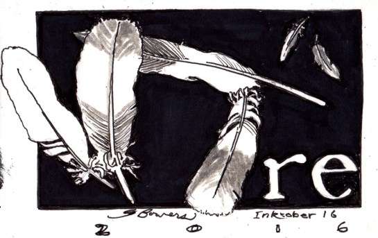
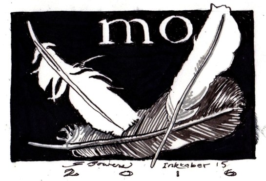
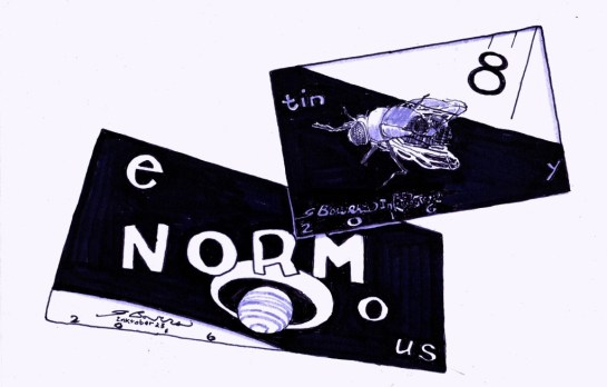
I’m using a variety of pens and markers for these Inktober images. I have a chisel-tip Sharpie that is my go-to tool for background blacks. I use it like a lawnmower, overlapping stripes on the area to be blacked. The problem is, corners and detail areas need the equivalent of garden edgers and shears.

I have two go-tos for such, and for drawing elements. They are an old-school Flair pen and a cutting-edge set of Micron archival-ink scribes from 005 up. Both inks are darker than the marker, and it shows, and close up it gives an Amateur Night feel to the image.

Fortunately, photoediting software enables adjustment of brightness, contrast and color. The one that comes with the Microsoft operating system is great at minimizing the difference between the inks, and brightening the light tones, and adding a tint if the image is better for it. I use MS Paint as well to remove smudges or correct mistakes. (A few posts back I had a quote from Dr Samuel Johnson. Stupidly, and in ineradicable ink, I “calligraphed” his name in lower-case as “dr samuel johson.” Paint enabled me to scooch over the “son” and make another “n” out of the lower half of the “h.” No one noticed the fudgework.)

Purists may shudder at these methods–I do myself sometimes–but economics and my own get-er-dun-soonest personality drives this behavior, and I don’t think I am alone; but I felt compelled to advise YOU, dear Reader, of the provenance of these images. I also feel compelled to add that the use of finer materials, and the independence from photoediting, almost always results in a better image. The problem is it can take a LOT longer to do it that way, and I don’t know how far over the horizon the end of my life is–and I have SO, SO many more images to make!

Thanks for your attention!

alt er cat ion 20161029.jpg

The Inktober prompts include “Battle.” An Altercation is synonymesque, but perhaps not synonymous. Cats are capable of fierce battle, as anyone who has seen a sincere cat fight may attest. This moustached bald guy is also battle-capable, but his stance and the expression on his face connote reluctance. The axially oriented doodads may be totems, or power sources, or mood indicators, or some supra-realistic transceivers–throw in a lot of And/Ors, and add what you will. You now have the image electrochemically preserved in your cerebral cortex. Consequently, it is now yours as well as mine, and you are free to make what sense of it you wish.

gfw 102816.jpg

Some time ago, in a Village of Oak Creek far, far away, I used pencil and then photoediting software to make an image I called “Spoon, Water, Glass.” When I post this blog entry it is likely that “Spoon, Water, Glass” will be listed as a related post, simply because I’ve just mentioned it twice. I hope it does. I don’t want to have to search for it, and I do want to compare it to this one.

If I had done a similar treatment with versification, I might have written this:

spoon, water, glass

heavy-duty morning;
stirring afternoon.
images a-borning
may require a spoon.

so they do. in this case
glass encases water.
case the joint and kiss face
if you think you oughtter.

–Well, as Old Lodge Skins was wont to say, “Sometimes the Magic works, and sometimes it doesn’t.” But every time you try, the Magic gets another chance.

feat 102516.jpg

It has been a long, good day, despite the Cubbies being shut out by Cleveland. I drew up a storm, wrote my usual Title Tuesday feature for Poets All Call on Facebook, and spent about three convivial conversational hours with my friend Clottee Hammons. (She will be showcased in a blog post in the near future.) I saw A HOLOGRAM FOR THE KING on DVD, and it had a few nice, refreshing moments in it, and a nice chemistry between the two romantic leads. And after a strong final hour of effort, the above drawing, though far from just-right, is right enough right now to fit in with the others, and is improvable later.

So Good Night, Good Friends, wherever you are. Sweet dreams and sweeter tomorrows.


re-10252016

My friend, the superb pastel artist and physician Beth Lindberg, responded to my question at the end of the last Feathers blog post, “More Feathers, anyone?” with “Yes, more feathers!” Here are six more now. Many more will follow.

IMG_20161024_0002.jpg

I had so much luck and fun with the Inktober 1-6 image montage that another seemed worthwhile, especially with hours and hours of more inking under my recent-drawing belt. Also, the pigeons outside my apartment continue to shed their delightful, miraculous feathers.

There’s a featherlike smudge on the lower right border. Unintentional, and easily eradicable in MS Paint, but it’s such a fit accident that it demands to stay.

As for “mo,” it follows the formula of starting to spell out what will be the title of the image montage. The three other panels will be “re,” “feat,” and “hers.” More Feathers, anyone? 🙂


14inktober

Here is a bit of wordless storytelling. The viewer is not given a whole lot to go on, and what there is is strange. There seems to be sadness and perhaps resignation. The title hints that the venue is not Planet Earth. There are odd juxtaposes and transparencies.

Pop quiz, class: What’s the story here? Any answer at all will do. If you think of a story that makes the image make sense, give yourself a gold star and an A. For extra credit, post your story in the Comments section . . . and if there are at least six comments, I will add mine. No pressure, though!