Archive

Tag Archives: Andy Warhol

Sometimes the impulse to draw springs from a mind’s-eye full-blown vision, with all the conceptual exploring already done. Other times there is a vague notion, of a character or a setting or a quotation, perhaps, and some exploration occurs while drawing. Yet other times the artist just grabs something to draw with and thinks, “I FEEL like drawing, but I have no idea. So let’s just see what happens.”

I have only a slight, tickly notion of what I was thinking when I made the original drawing, which likely happened at least eight years ago. I think I was imagining the taking of an oath of office in a future where doing such would be much more reflective of the person elected, and not straitjacketed by hand-on-Bible or other arcana.

Some day I’ll take a drawing as incompletely formed as this one was, make a hundred copies, and finish them a hundred ways, each as radically different from all the others as reality, including my imagination, allows. It will be an odd hat-tip to Andy Warhol, for reasons obvious and not.

On Friday, August 28, I’ll be participating in a tribute to Jack Kirby conducted by Russ Kazmierczak, Jr. and featuring Steve Rude (!!!) So I’ve been doing some Kirby immersion, preparing for the event. One of Kirby’s creations was The Demon, who’d transform from the human with the incantation, “Leave, leave the form of man/Rise the Demon, Etrigan!” I always thought of him as a tortured soul. And in my novel attempt Auld Lang Synapse, I had an untortured soul who nonetheless was foredoomed from prebirth to be vastly different from his fellow human beings. His name was Noel the Fork.

Today, then, I did an odd mashup. I took the Excel grid upon which I constructed the sonnet encapsulation of Auld Lang Synapse, in acrostic form and strict as to characters/spaces per line, and did a line drawing of a creature that partakes both of Etrigan and Noel.

auld lang sonnet illo 082215

Image

It’s over a hundred years since le Cubisme made its first appearance, spearheaded by Pablo Picasso and Georges Braque, with perhaps a precursive boost by Paul Cézanne. The movement purported to offer a different way of looking at things, by chopping up the image with different views of its subject. Then came Comic Books, which chopped up the page with different slices of represented life. Now comes the self-aggrandizing Gary W. Bowers, who presents the same subject at slightly different viewpoints and times, thanks to camcorder technology and nifty photo-editing software. (Andy Warhol gave me a precursive boost with his image multiplicities. Thanks and RIP, Andy!) New Cubism lives!

Image

Today was the day of the Orthopedic Consult. In true 21st-century fashion, the patient was weighed, vital-signed and questioned by a personable, computer-entry-savvy assistant, then left to stare at walls for a while. At not-bad length there was hearable conversation outside the door of the assistant bringing the orthopedist up to speed. Swish of chart folder, quick tok=tok knock, and in comes the personable, orthopedics-savvy Orthopedist, M.D., Ph.D. A few more questions for the patient. The good news that the X-Rays look good, with circumstantial evidence indicating no rotator cuff tearing, The dismaying news is that there is age-related stiffness, bursitis, and degeneration typical of a patient the patient’s age.

Image

Two long-needled shots of cortisone will loosen the shoulder in a couple of days. “It may be a little worse at first.” But the very good news is there doesn’t seem to be any need for an MRI, nor surgery, nor physical therapy. “Just use it a lot.” An appointment is made for four weeks hence, and the orthopedist suggests it be cancelled if the shoulder feels good. The patient admires and appreciates this cost-containment attitude.

Image

On the way out the patient is given a PIN for his Patient Portal online access–another 21st-century step in the right direction. Information such as this is available with a few mouse clicks:

Image

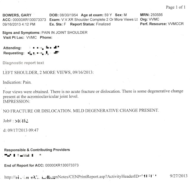
(The patient made an image of the document, opened it in Paint, and used a nifty desizing-resizing trick to efface some identifying information.)

Image

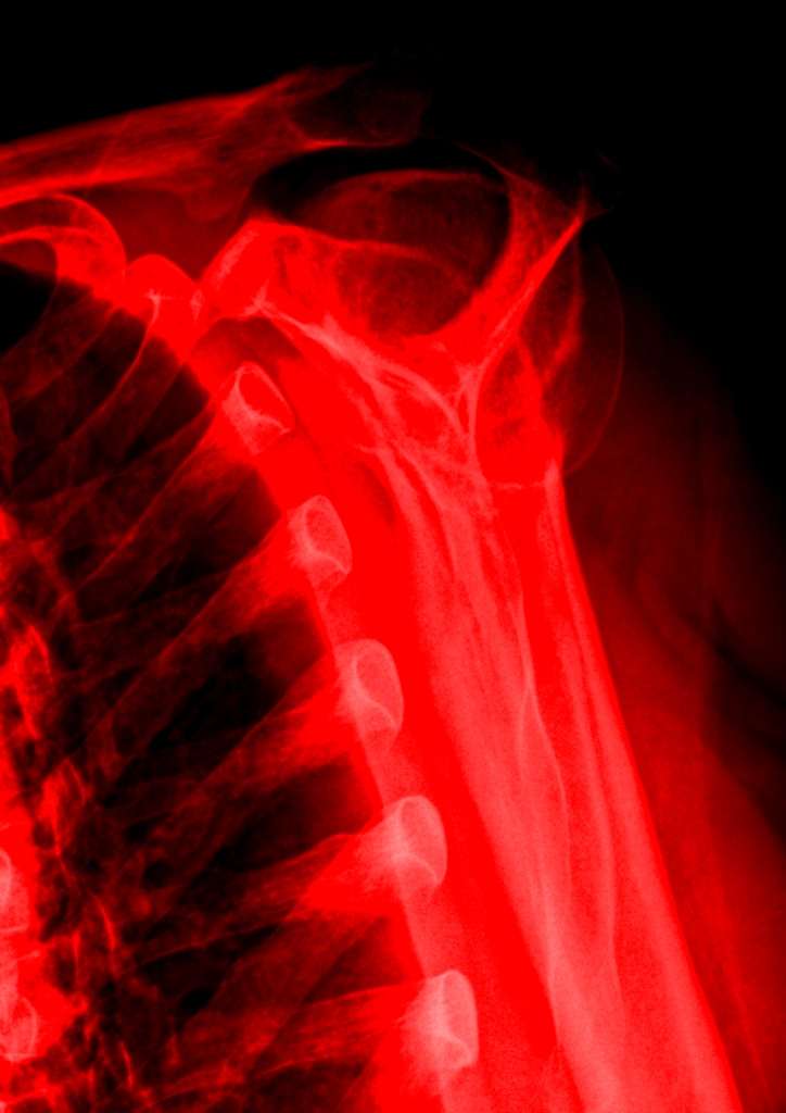
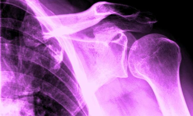
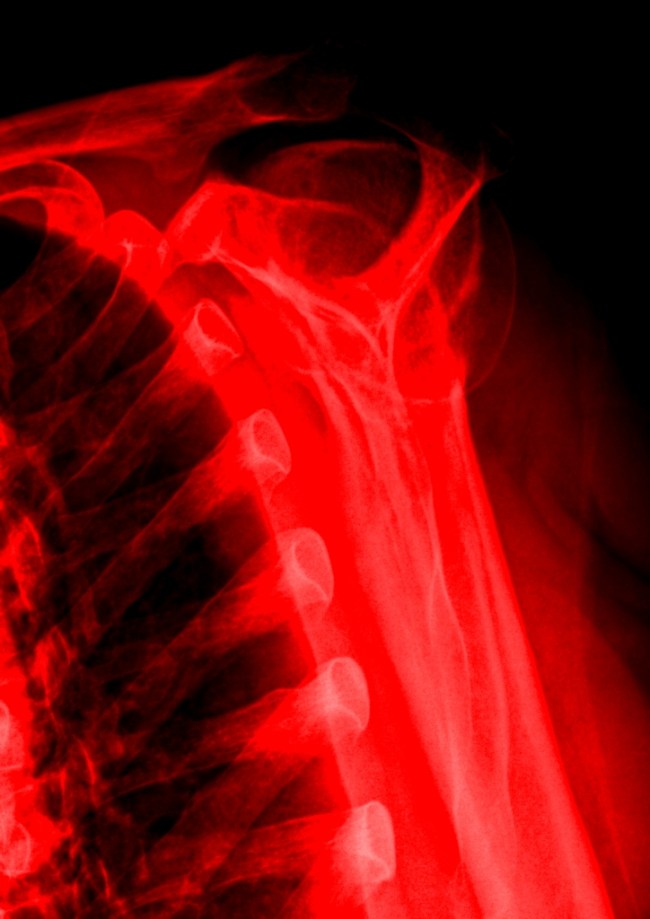
Best of all, the X-ray shoulder views are available, and simple photo-editing software–Paint and Microsoft Office Picture Manager–may be used on the images. Andy Warhol did stuff like this the hard way, back in the day. Longer ago, Robert Rauschenberg had to content himself with light-reactive paper and bright, bright light for some white-on-blue skinscapes of him and his companion. But now–colorizing, brightness&contrast, data compression and many other image-manipulative techniques are easy as pie, funfunfun, and available with the latest operating systems!

So here are four shoulderscapes. If time were not of the essence I would have happily spent another several hours playing with the image; alas, time is scarce. These four, though, demonstrate how color, contrast and cropping of the same subject matter might yield four quite different visual payoffs.

“Shoulder and shoulder and bolder and bolder we grow as we go to the fore.” Give me some Peeps who are Stout-Hearted Peeps! [smiles. fade to white]

Image

This August 3rd morning I was scheduled to work solo at the Village Gallery from 10 to 2, which really means 9:45 to 2:05, since the cash register must be counted before opening the doors, and the baton must be passed to the relief before leaving. But it was a quietish day and I had plenty of time to sketch–and we artists are encouraged to practice our art during our shifts, busy-ness permitting. Consequently, by the time I left the gallery, I had the above image, which hadn’t even been a twinkle in my eye when I’d arrived.

First there was doodling, keeping the “Op Art” movement of about half a century ago in the back of my mind, but also bacterial or fungal growth. I used loopy/circular shapes and outlined the bejabers out of them, inside and out. By 11 AM the graphite “fungus” had spread throughout the scratch paper I was putting it on.

I then employed the shop copier to make a copy, leaving room to put the original in the blank extra space to make a copy of the copy and the original, upside down relative to the copy. This is a bit of a nod to Andy Warhol and his instant-motif image multiplicities.

The image needed a lot of embellishment to make it interesting. It also lacked soul; it had no more soul than wallpaper. So I hearkened back to my coloring-book days and filed in some of the whorls, first with highlighter (which smudged a little, and all to the good: I wanted to avoid the sterility of perfect fill-in) and then with mechanical pencil.

I still had “Op Art” in the back of my head, and, being stuck in the 60’s, it also occurred to me that with a snazzy bit of lettering, the image had poster possibilities. What to call it? Well, when I was doing the fill-in I imagined elements in the two panels being compelled toward each other–and the color choice and selectivity of the fill-in thus reflects a sort of yearning that almost everything that lives has in it. So “Yearning” would be a good title, and–bonus–by following the same drawing rules I’d (rather arbitrarily) decided on when I started, I could pull out “ye” (you) and “i” for a bit of found-art spice. I did the same thing with signature and date, yellowing “W ow” (Wow) and “Au” (chemical symbol for Gold).

Is it Art? Does it Work?

Image

Today is exactly 3 months since I started this blog. I have not missed a day; that’s 91 daily posts. I celebrate by presenting two pages today.

The first is of Lee Radziwill, a tragic figure if ever I saw one. Many of the people who gave her life weight–sister Jackie, brother-in-law Jack, Her former husband and son, both princes, and Andy Warhol and Truman Capote–are long gone.Today, she bears enough of a resemblance to Jackie that it is easy to imagine what Jackie would have looked like, had she lived this long.

By the way, Wikipedia says it’s not pronounced RAD zee will, but RRAH gee veeaw. Yet another cross for her to bear is that probably almost no one can say her name correctly.

Sympathies and best of luck to Lee, who is actually Caroline, a beautiful name once worn by my grandmother, who died before I was born. On to Continuity Pleas:

Image

This page was started a long, long time ago. I don’t have much to say about it except that I am glad to have reduced my unfinished projects by one this morning. Also: aside from the triple acrostic, I gave myself the additional constraint of using a maximum of three words per line. Oh, and Beale Street is a famous landmark of Memphis, Tennesee.

Image

Here are three Graphic Heroes of mine, and they have three things (or more) in common. All are known more for their drawings than their paintings. All shook up the status quo. And all have known prolificity.

About twenty years ago, the Phoenix Art Museum hosted a show featuring Walt Disney, Keith Haring and Andy Warhol. Here’s what David Bryant of THE LIBRARY JOURNAL had to say about the book made from the catalog of that show: “This book is the catalog of the Phoenix Art Museum exhibit of the same title. Brilliantly colorful, this well-designed paperback is full of whimsy, fantasy, and the engaging simplicity of its images, the work of three extremely popular American artist/illustrators. The late Haring regarded Andy Warhol and Walt Disney as two of his art heroes. Kurtz, curator of 20th-century art at the Phoenix Art Museum, gathered the works for this show, many previously unseen. Haring’s exuberant, lovable cartoon art serves as the glue uniting the work of the three artists. Brief but well-constructed essays on Disney, Haring, and Warhol serve to clarify the role of each in American popular culture. Recommended for academic, museum, and public library collections.” My trio is not as household-namey as theirs, but the Kollwitz/Adams/Crumb trio has influenced me enormously, and I hope more art lovers become acquainted with them.