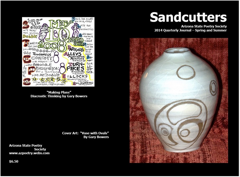
Faithful readers may recall a blog from last September entitled “Carol Hogan, Cutter of Sand.” It was written when Carol Hogan, now President of the Arizona State Poetry Society, invited me to be the Featured Artist/Poet for a quarterly issue of the Society’s publication SANDCUTTERS.
A few days ago I received a complimentary copy of the issue. The front and back cover feature my pottery and acrostic poetry, thus:
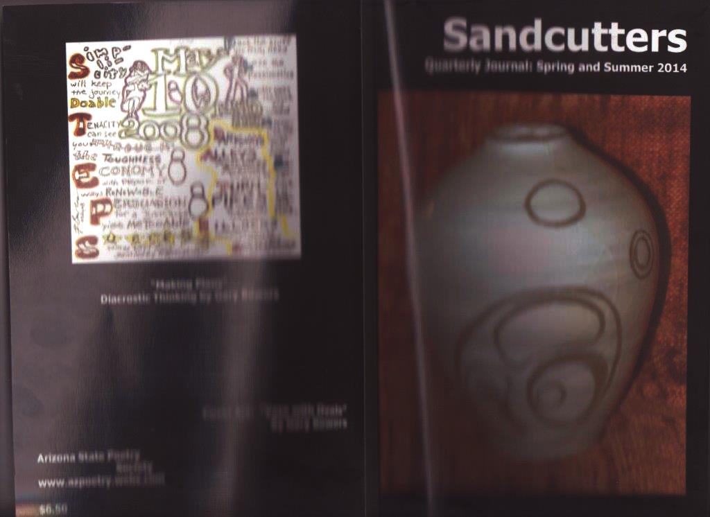
It’s a beautifully printed cover, glossy, crisp and full-color. The scan I made of it suffers from my not making separate scans of front and back.
Inside the magazine, they were quite generous with space for me–a dozen pages out of 86 total. The photography of my pottery and sculpture, all by Carol, is quite fine, and the reproductions of my acrostic pages are straight out of my blog posts. So why would I let a few typos and an editorial change in the biographical text I provided bother me?
Ironically, it is because I have bouts of raging egomania, and the editorial change makes me sound, to my mind’s ear anyway, like a raging egomaniac.
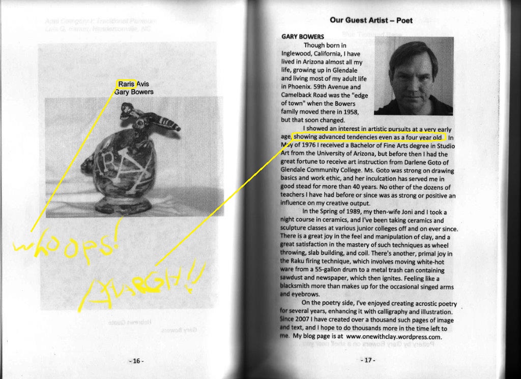
Here is one paragraph of the bio I wrote, verbatim:
“I showed an interest in artistic pursuits at a very early age. My mother has a pencil drawing of mine done before I was four years old. She is proud to point out that the figure drawing, of her, has five fingers on each hand. That they are each the length of the rest of the drawn arm is irrelevant to her. Also, the smile I drew on her transcends the oval of her face–early evidence of Expressionist leanings.”
Here is how it was changed, without prior approval from me:
“I showed interest in artistic pursuits at a very early age, showing advanced tendencies even as a four year old.”
Of course there was a compelling reason to make a change: the text would not all fit on one page without reducing the word count. But if I’d been tasked with cutting 60 words from the original, I think I would have tersified the whole bio slightly rather than take the axe to that one paragraph–and I never would have boasted of “showing advanced tendencies.”
Stung from one change, I looked on the opposite page and found another. My title for my sculpture of a strange bird is “Rara Avis,” which is correct Latin for “Strange Bird” in the same way “Angina Pectoris” is correct Latin for “Strangling of the Chest.” But the editor, perhaps thinking that adjective/noun agreement extended to word endings, changed my title to “Raris Avis.” I’m sorry, Friends, but that’s just plain wrong. There were other errors amongst the titles as well: “Burred Visions” instead of “Blurred,” “Blue Textured Base” instead of “Vase.”
Am I making a mountain out of a molehill? Am I conducting a tempest in a teapot? Putting the Cur in Curmudgeon?
Yes and no. I’m delighted, and honored, and grateful to be in SANDCUTTERS at all, let alone being singled out for special distinction. I don’t feel nearly the outrage that Harlan Ellison felt upon his pilot script for THE STARLOST being rewritten by Norman Klenman, starting with the title “Phoenix Without Ashes” being changed to “Voyage of Discovery.” And I’m nowhere near the umbrage Robert Heinlein took at the repeated second-guessing his Scribner’s editor Alice Dalgliesh inflicted on Heinlein’s submissions. But editorial standards seem to have declined in this century, evident everywhere from newspaper copy to television news captions. If we don’t make a stand and point out errata, we can only expect worse in the future–and SANDCUTTERS deserves better.
Last night I called Carol and gave her a head’s-up that I’d be doing this blog post. “I’ll do my best not to hang you out to dry,” I told her, after reviewing my grievances. And, indeed, Friends, the job of an editor is almost always thankless and stressful: there are dozens of people to please, hundreds of people that will be necessarily disappointed, and often credit goes to the so-called “talent” when the editor has bent over backwards to make them look good. So three cheers to Carol for fitting all the goodness of this SANDCUTTERS into the Procrustean bed of a single publication. And please, poets in and outside of Arizona, check out http://www.azpoetry.webs.com for the Internet equivalent of such goodness, plus goodies that include submissions guidelines. Please tell them Gary sent you!