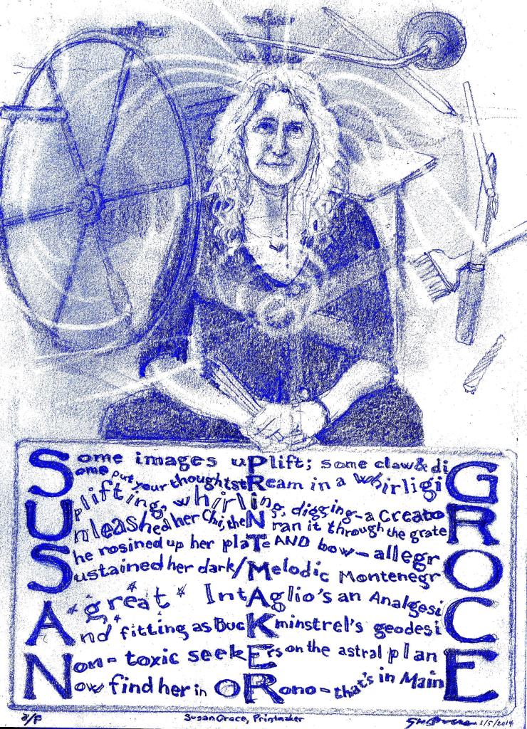
Some images uplift; some claw & dig
Some put your thoughtstream in a whirligig
Uplifting, whirling, digging–a Creator
Unleashed her Chi, then ran it through the grater
She rosined up her plate AND bow–allegro
Sustained her dark/melodic Montenegro
A g r e a t Intaglio’s an Analgesic
And fitting as Buckminstrel’s geodesic
Non-toxic seekers on the astral plane
Now find her in Orono–that’s in Maine

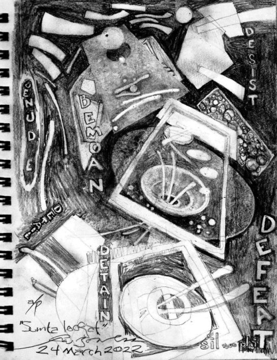
I put the poem before the image because I think I was more successful with the former than the latter. There is sometimes an inverse relationship between how much I worry about a getting certain subject RIGHT and the quality of the image that results. Simply put, I tried too hard on this one, and it got out of hand.
But that’s OK, because–as I indicate in the signature line, deliberately made to look like a signature at the bottom of an intaglio print (and notice that the poem is subtly framed in what vaguely looks like the beveled plate-edge of an intaglio), that this is an a/p, which is printmakerese for “artist’s proof.” It’s another way of saying “work in progress, not yet suitable for an edition,” or “I didn’t go yet.” And indeed I hope, perhaps in my retirement years, that I’ll have access to an intaglio studio and press, and I’ll turn this crude drawing into old-school gold.
The thing is, the Intaglio process is obsolete. It was invented sometime around the 14th Century almost by accident, an offshoot of the engraving of gold with incised accents, which were then rubbed with contrasting pigment. It became a way for artists to translate one image into many salable prints. But it’s a demanding process: take a copper or zinc plate, sand off the milling marks and then polish it with jeweler’s rouge, bevel the edges so they don’t cut into the roller, and then incise the plate with an image that is the reverse of the one you want, using a burin or other engraving tool; or coat the plate with carborundum and use a carbide scribe to etch through the coating, then to be submerged in an acid bath; or put the plate in a box full of rosin dust and diffuse the dust into the air above the plate, so that it settles on the plate to become maskable tone dippable in acid–ah, it is so much more gratifying to DO these things than to describe them, but it is a real chore to learn how to do them with skill. Susan Groce has taken time and pain to translate her kaleidoscopic visions into editionable form, and for that she has my respect and admiration. She stuck to it, made a career out of it, and flourished.
And she’s taken a concern with the environment and with physical health to investigate non-toxic means of printing. A good thing, too: the print room I remember had air that was a minestrone of fumes: carborundum, burnt plate oil, kerosene, denatured alcohol, the mustiness of paper soaked too long, nitric acid–and I’m far from done; haven’t even gotten to lithography chemicals, which were in the same room. Good for her for seeking safety for herself and her contemporaries.
And good for her for her multi-talented creative soul. As I indicated in “take 1,” she is an accomplished violinist. Thus the line “She rosined up her plate AND bow–allegro” refers to the fact that both the Aquatint printmaking process and the bow of a violin require rosin. I was also glad to mention “Buckminstrel” Fuller in her sphere, as he was a like multitalent with a care for the environment and human quality of life. His notebooks and Susan’s have some overlap, and I commend both to the viewer’s attention.
I invited Susan to offer a quotation from any of her artist’s statements, or a link she’d like readers to be steered to, for me to include in the image. She graciously declined, being very busy with the Semester-End Madness aspect of her professorship. But she’s easy to find as department chair at the University of Maine at Orono, and I hope any interested parties take a look at her artwork and her benign-materials investigations.